Minor project · R / ggplot2
Warming Stripes
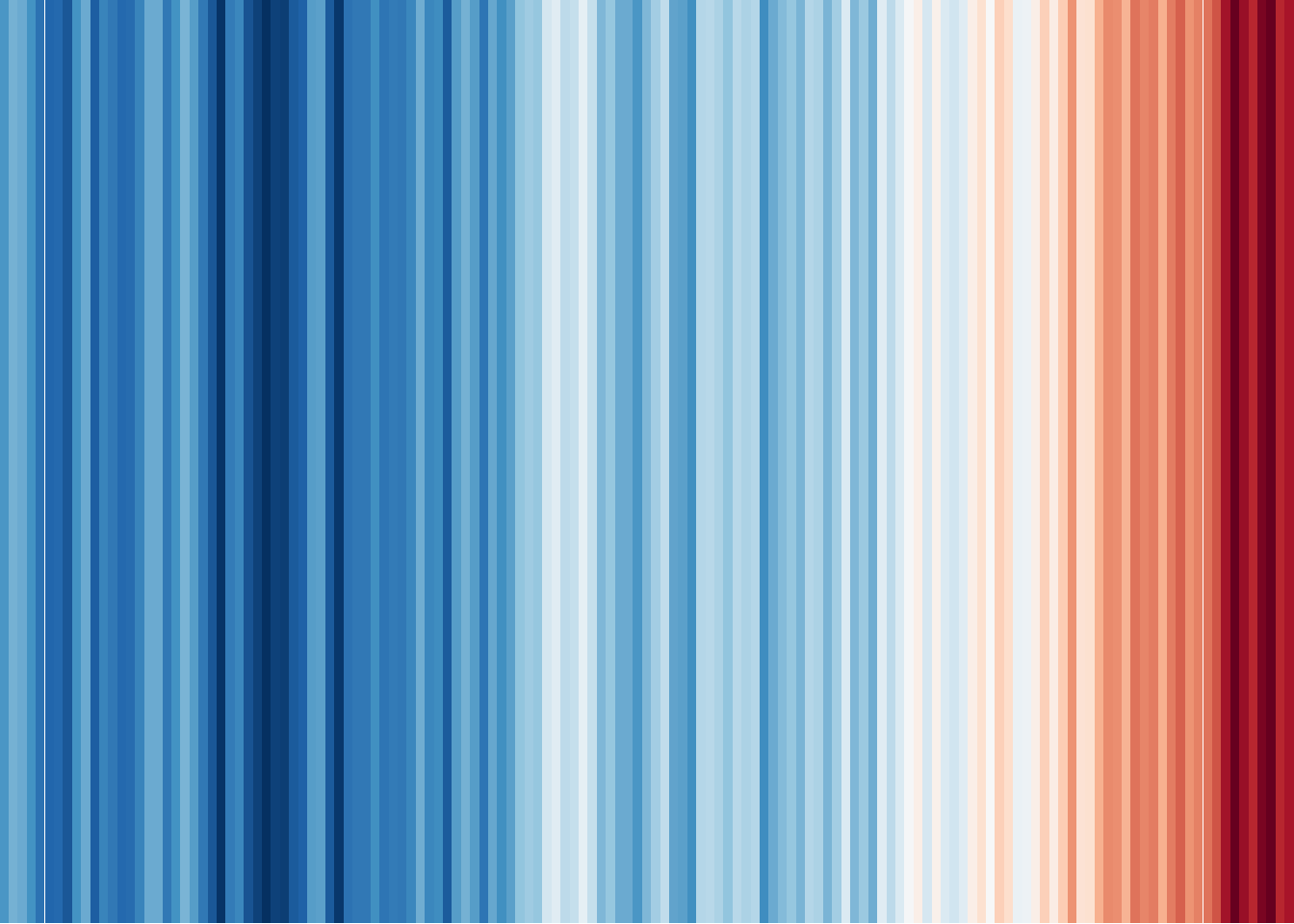
The stripes that run through this whole site started here. Each band encodes one
year of global temperature, ordered in time — a single value, observed across a century.
Below is the full recipe in R, using NASA GISS data and ggplot2.
Global temperature anomaly · illustrative rendering
Required libraries
library(dplyr)
library(data.table)
library(stringr)
library(tidyverse)
library(lubridate)
library(RColorBrewer)
library(plotly)
Pre-processing
Read the global land–ocean temperature index straight from NASA GISS, coerce the annual
J-D column to a number, and parse the year. The last (partial) row is dropped.
warm_strip <- fread("https://data.giss.nasa.gov/gistemp/tabledata_v4/GLB.Ts+dSST.csv") %>%
  mutate(`J-D` = as.numeric(str_replace(`J-D`, pattern = "-.", replacement = "-0."))) %>%
  mutate(Year = ymd(Year, truncated = 2L))

warm_strip <- warm_strip[1:(nrow(warm_strip)-1),]
Preparing the theme
Strip the plot down to nothing but the stripes, and pick a diverging red–blue ramp
(RdBu) that will be reversed so warm reads red.
theme_strip <- theme_minimal()+
  theme(axis.text.y = element_blank(),
        axis.line.y = element_blank(),
        axis.title = element_blank(),
        panel.grid.major = element_blank(),
        legend.title = element_blank(),
        axis.text.x = element_text(vjust = 3),
        panel.grid.minor = element_blank(),
        plot.title = element_text(size = 14, face = "bold")
  )

col_strip <- brewer.pal(11, "RdBu")
The graphic
One tile per year, filled by the anomaly, with the ramp reversed — the finished warming stripes.
ggplot(warm_strip,
       aes(x = Year, y = 1, fill = `J-D`))+
  geom_tile(show.legend = FALSE)+
  scale_x_date(date_breaks = "6 years",
               date_labels = "%Y",
               expand = c(0, 0))+
  scale_y_discrete(expand = c(0, 0))+
  scale_fill_gradientn(colors = rev(col_strip))+
  theme_void()